Redesigning a university's library website
CHALLENGE
The Gottesman Libraries website is a central point of access to research materials, services, spaces, and support for the Teachers College community.
By 2018, the site had become difficult to navigate and no longer reflected how patrons used the library. Content had grown across multiple systems, the information architecture was unclear, and many students relied on search engines or staff workarounds to find what they needed.
The library needed a more user-centered website that made resources and services easier to find, created a more cohesive experience across its digital tools, and better supported remote use.
PROJECT TIMELINE
January to June 2018
MY ROLE
I defined the research goals and led research throughout discovery, design, and launch. I conducted stakeholder interviews, facilitated a participatory design workshop, analyzed behavioral data, ran usability testing, evaluated third-party tools, and translated findings into recommendations for design, development, and library leadership.
RESEARCH METHODS
Stakeholder interviews, participatory design, analytics and server-log analysis, guerrilla and moderated usability testing, competitive analysis, and vendor evaluation
BACKGROUND
The library served Teachers College students and faculty as well as members of the broader Columbia University community. Most Teachers College patrons used the website remotely, making the digital experience an essential part of the library service.
The site had also grown into an ecosystem of separate tools, including the catalog, room reservations, course reserves, support requests, and static content pages. These services did not always feel connected, and several had been built or maintained independently over time.
The redesign gave the team an opportunity to rethink both the website and the broader service ecosystem around it.
PROJECT GOALS
-
Organize the site around patron needs and behaviors
-
Make resources, services, and support easier to find
-
Reduce unnecessary steps and create clearer pathways through the site
-
Improve cohesion, accessibility, and ongoing content management across the digital experience
APPROACH
1. Understanding the existing experience
I began by gathering evidence from staff, patrons, historical site decisions, and behavioral data.
Stakeholder interviews
I interviewed library staff to understand common patron questions, recurring service problems, and the workarounds employees had developed to compensate for weaknesses in the website.
Reviewing earlier versions
Using the Internet Archive and conversations with longtime staff members, I reviewed how the website had evolved since the late 1990s. This helped the team understand why certain structures and design decisions existed before deciding what to retain or change.
Participatory design workshop
I facilitated a workshop with approximately 30 library staff members to surface concerns, align around patron and organizational goals, and generate ideas for the future experience.
Activities included writing “love” and “breakup” letters to the existing site, identifying patron goals, and collaboratively sketching service improvements.
Analytics and search behavior
I analyzed Google Analytics, Matomo data, server logs, and on-site search terms to understand which pages and services patrons used most often.
This behavioral data helped validate stakeholder concerns and identify high-priority pathways for the redesign.
Rapid usability testing
I conducted brief usability tests with 10 students in the library during finals. These sessions helped uncover immediate navigation and content problems while also providing context about students’ research habits and relationship with the library.
Evaluating external tools
Because the redesign included several independently built systems, I evaluated third-party options for room reservations and support requests.
I created comparison matrices, spoke directly with vendors, and presented options to library leadership based on functionality, flexibility, cost, and fit with the broader experience.
DISCOVERY FINDINGS
Research revealed several recurring problems:
-
The homepage contained too much competing information.
-
Important content was difficult to find through browsing.
-
The visual design felt dated and unwelcoming.
-
Small text and dense layouts made pages harder to use.
-
The site’s organization did not match patrons’ expectations.
-
Separate library systems did not feel like parts of the same experience.
-
Some users bypassed the site entirely and relied on tools such as Google Scholar.
2. Testing and refining the redesign
I partnered with the UX designer to test prototypes throughout the design process.
Early concepts were tested through short, informal sessions for rapid feedback. As the design matured, I conducted longer moderated usability sessions using realistic tasks and scenarios.
Testing focused on navigation, search, content findability, and the relationship between the main website and connected library services.
TESTING FINDINGS
Feedback helped the team refine several parts of the experience:
-
Users found the relationship between the website, catalog, and support tools unclear.
-
Search results were sometimes confusing or did not match expectations.
-
Navigation and content organization improved substantially in the redesigned experience.
-
When participants were asked to find content by browsing, task success increased from 60% on the previous site to 90% on the redesigned site.
3. Building ongoing measurement into the experience
The work did not end at launch. I identified behaviors the team wanted to track beyond standard pageviews and partnered with developers to configure custom analytics events.
These included:
-
Search behavior
-
Header and footer navigation
-
Homepage quick-link use
-
Room reservation activity
-
Differences between links accessed from the homepage and those reached elsewhere
I also monitored support requests, social media mentions, and other sources of unsolicited feedback to identify emerging problems after launch.
OUTCOMES
The redesigned website launched in June 2018 with clearer navigation, a more focused homepage, and improved pathways to library resources and services.
The new quick-links section became an important entry point to frequently used content, while catalog search remained the most common action across the site.
The research also influenced decisions beyond the main website. Library leadership adopted a hosted support-ticket platform based on the evaluation I conducted. The system could be customized through APIs, helping create a more cohesive experience across the library’s digital services.
The project established a stronger foundation for ongoing user research and analytics, giving the team a way to continue evaluating how well the website supported patrons after launch.
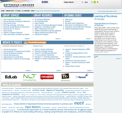

Before (left) and after (right) the redesign: The updated homepage introduced clearer hierarchy, simpler navigation, and more direct paths to the library’s most-used resources and services.